Making Our Content Future-ready
– the Responsive Way
What is Responsive Content or Responsive e-learning?
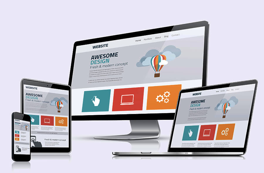
E-content that suits and responds accurately across devices is called responsive. The concept of ‘responsive learning’ is just an extension of the ‘responsive design approach’ where content gets seamlessly adjusted to the size of the screen, irrespective of the device on which it is accessed. In simple terms, responsive e-learning includes all e-learning solutions that are developed for multiple devices – be it your desktops, laptops or your smartphones. In this era of digital disruption, where a substantial part of the learning may ‘happen on the go’ and ‘across devices’, ‘responsive content’ is every learner’s and solution provider’s implicit requirement.
Why do need our e-learning to be responsive?
Responsive e-learning addresses the realistic challenges of today’s online learner, who may start with one-hour e-learning module on his desktop early in the day, move on to his iPad by noon, access some part of the training on his smartphone in the evening, and eventually take an assessment on his laptop the following day. Do you think this transition across multi-devices would have been possible if the training module was built using the conventional course design framework?
Today, a learner who may be a professional or a student does not want to limit himself to his desktop or iPad, but continue to learn as and when the time permits and on whichever device is accessible. Irrespective of the screen size, this content design framework permits the learner to experience uninterrupted #sequential usage while enjoying optimal view and quality across devices. This freedom to seamlessly access the content at any time and on any device liberates the learner from any kind of machine dependency. So, responsive e-learning is the ‘futuristic approach’ for online training and overrides a learner’s constraints of limited time and frequent transition between devices.
How is responsive design different from adaptive design?
Often an ‘adaptive’ design is confused with a ‘responsive’ design. Let’s see how these design frameworks are different from one another.
An adaptive e-learning course requires us to develop varied screen layouts for specific devices or groups of devices. For instance, a number of layouts for a course may have to be developed for learners accessing the content via their desktops, laptops, tablets or any other specific smart mobile device. The limitation here is that we need to invest additional time and resources for developing separate versions or layouts for different devices. Do you think any of these layouts would be compatible with future devices or platforms? Well…looks difficult!
To overcome this limitation ‘responsive design’ approach comes to our rescue. We can now develop a master course in the HTML5 framework and ‘empower’ our dynamic design to fit reliably to any screen size across existing or future devices. This ‘fluid’ and futuristic design framework is both time and cost-effective.
How can we develop responsive e-learning?
An array of authoring tools are available that enable us to develop responsive e-learning. A new-age e-learning authoring solution that promises to meet (and exceed) our prerequisite for developing a responsive e-learning content is #Sleave. Based on the HTML5 framework, this tool is fully loaded with authoring capabilities that allow us to create truly-#responsive e-content, ranging from #animations, #simulations, #games, #assessments, and #websites. While developing ‘out-of-box’ responsive content, we can also enjoy the benefit of seamlessly collaborating with our entire project time in run-time and shorten the entire production cycle.
Reach out to us at sales@esleave.com to schedule a demo for ‘Making Our Content Future-ready – the Responsive Way’!
Author – Namrata Bhatia